Shop from Recipe
Meal Hero is Wellio’s AI-powered Meal Planning and Grocery App
Role
sole designer for team that focused on the home page experience including: search & browse, recipe pages, account, and personalization
All Research, UX, Visual Design and UX Writing for the project
Challenge:
Meal Hero has a history of low user engagement in the Shopping List Tab. This is where users create their shopping lists and go for shopping On average ~3% of returning users engaged with the Shopping List. Our KR for the quarter was to increase the total volume of traffic to shopping list from Home (Discovery).
Process
Research:
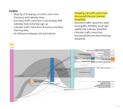
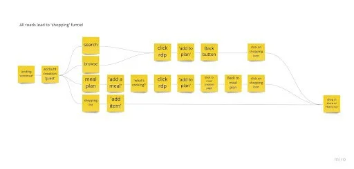
I spent some time putting together a user flow that gathering relevant information on shopping and how it intersects with the discovery journey.
Key Insights:
53% of shopping list traffic came from discovery activities
discovery activities = recipe page and meal plan page
there is an opportunity to surface shopping list features earlier in the user journey
We explored different user flows based on opportunities we found during research.
Scope
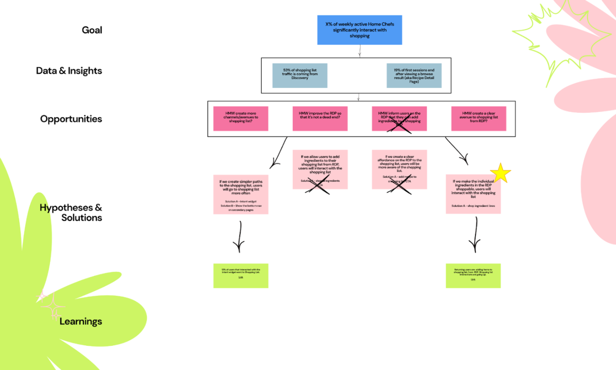
For this project we experimented with using a Thoughtful Execution Framework (à la Spotify) to focus the project on a goal. This is a good source of truth for the whole team to refer back to the “Why” of what we are building.
We tested our hypotheses and narrowed it down to one solution that we were the most confident in would drive us towards our key metrics. ⭐️
Solution: If we enable users to add ingredients to their shopping list within the recipe detail page, users will interact with the shopping list more.
Design
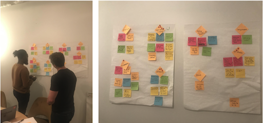
I ran design sprint to gather ideas with stakeholders including full participation from my engineering partners.
Brainstorming
Storyboarding
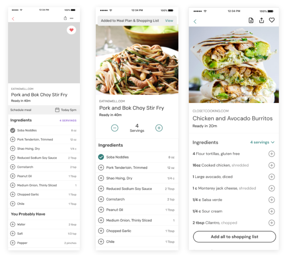
Using the ideas generated from ideation, I crafted a user journey from recipe detail page to shopping list to support adding individual ingredients to the shopping list.
→
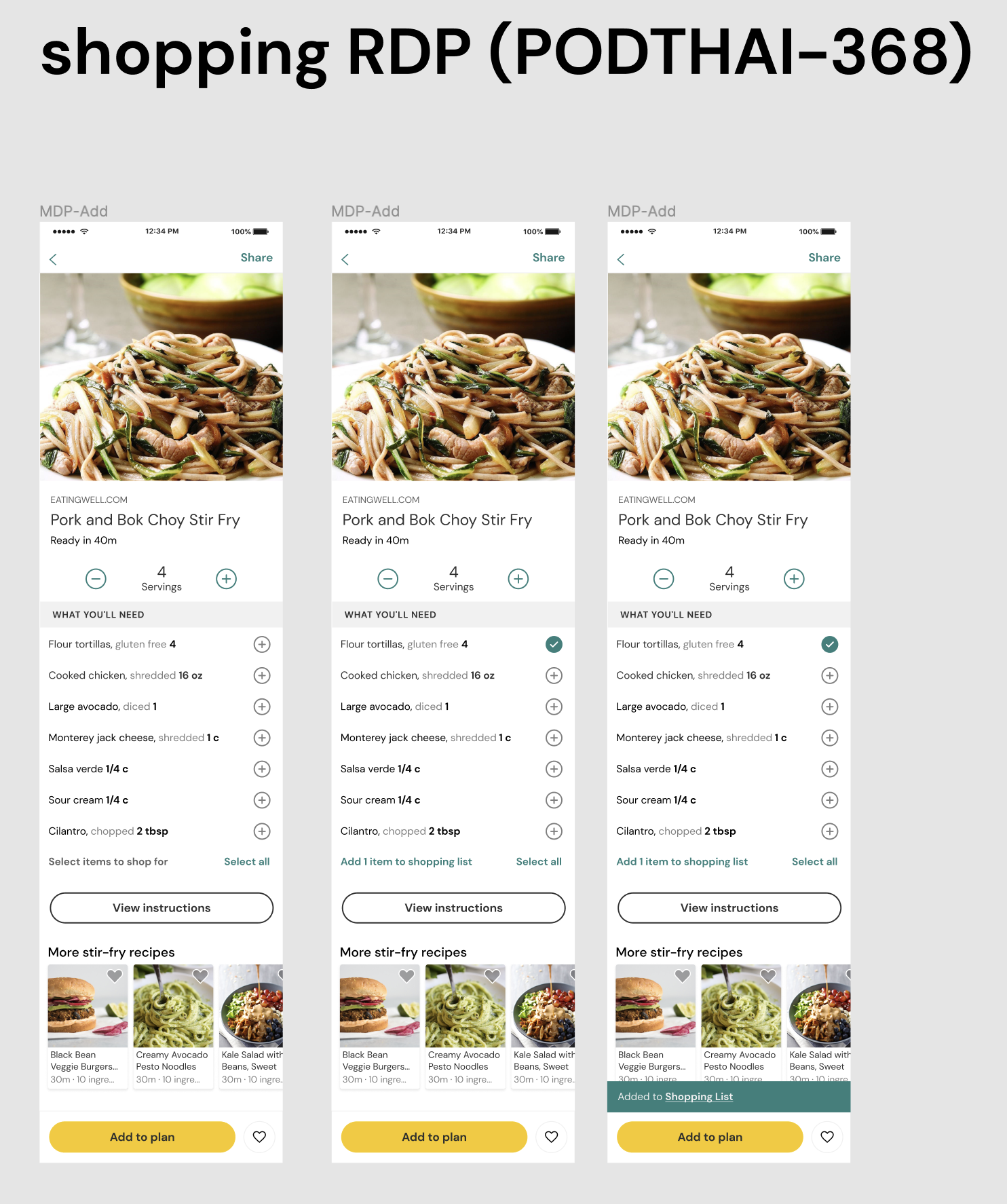
Final user journey
Using our growing component library, I was able to quickly create hi-fi prototypes for testing.
Testing
Through user testing, we learned that
Users preferred the selection icon on the right hand side
Selecting individual ingredients and adding all ingredients were both important interactions
Users were delighted that they could add to their shopping list directly on the recipe
Handoff
What we shipped:
Impact
By enabling users to have more control and flexibility over what types of ingredients they could add to their shopping list, it reduced friction within the shopping list page. Returning users who engaged with the shopping list increased from 3% to 8% within 10 months.
Retrospective
Building for ease as well as personalization helped drive us towards our key business goals. I loved experimenting with the thoughtful execution framework and will continue to use it in my design process where it feels necessary.


